I’m Sam
What’s Up?
A little About Me
Certified desert rat with a strong passion for art and graphic design. I specialize in creating strong, bold, and colorful designs. I enjoy challenging design work that makes me think about different scales. From the smallest design perameters, to the size of a bus and everything in between.
BEEFY’S
Mural
And So It Begins…


I began by creating digital mockups on my iPad, experimenting with different mascot designs and developing a color palette that reflected the restaurant’s branding. After iterating through multiple versions, I landed on a design that felt vibrant, playful, and true to the spirit of Beefy’s.
Design And Mockups
Vinyl Stenciling
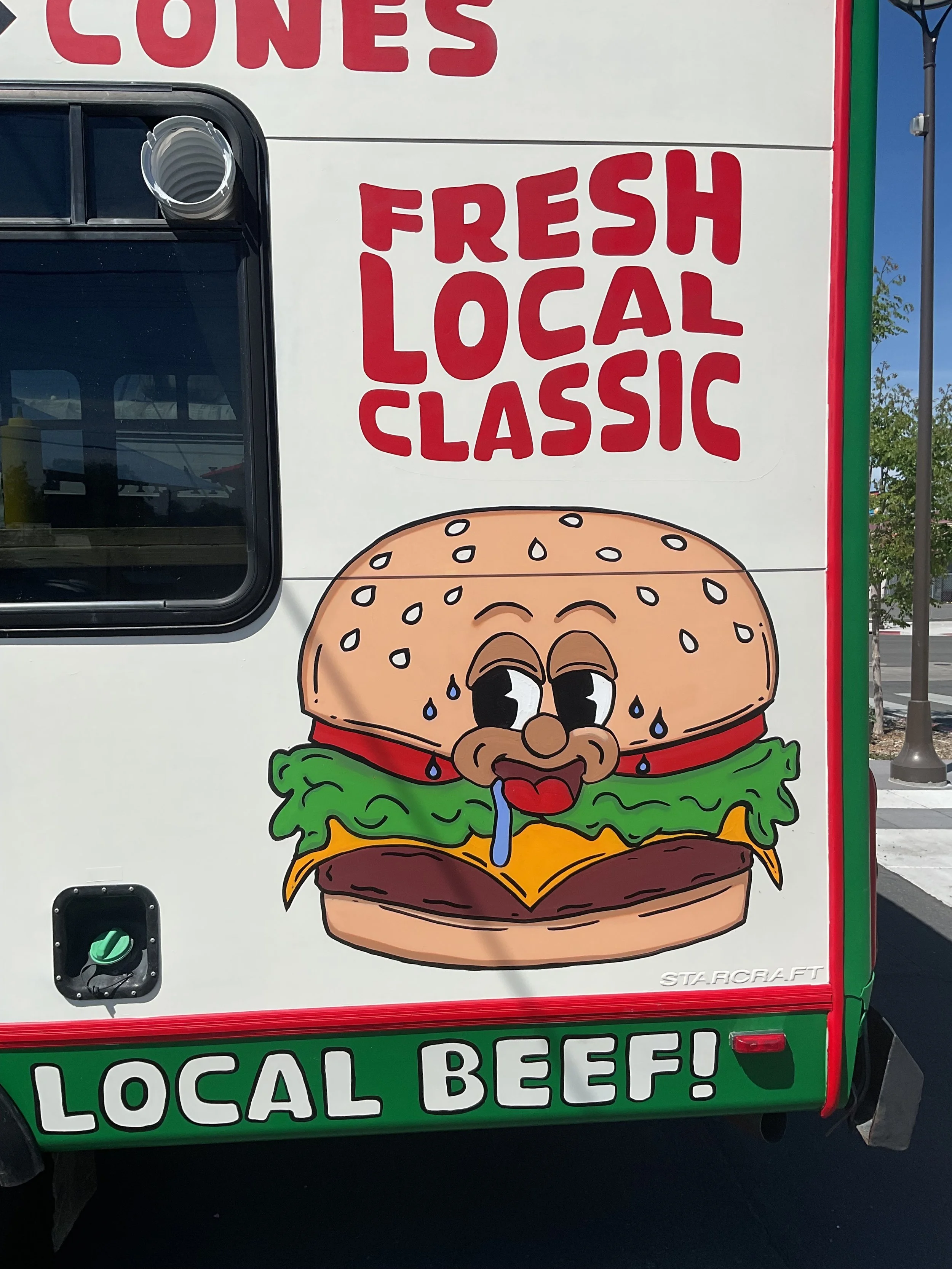

This was one of the biggest—and most intimidating—projects I’ve taken on to date. The owner of Beefy’s was looking for a local artist to bring a bold, creative vision to life on a newly acquired bus, which was being converted into a miniature dining room. The brief? Combine advertising, character-driven artwork, and a touch of humor. A friend recommended me for the job, and soon enough, I was sketching concepts.
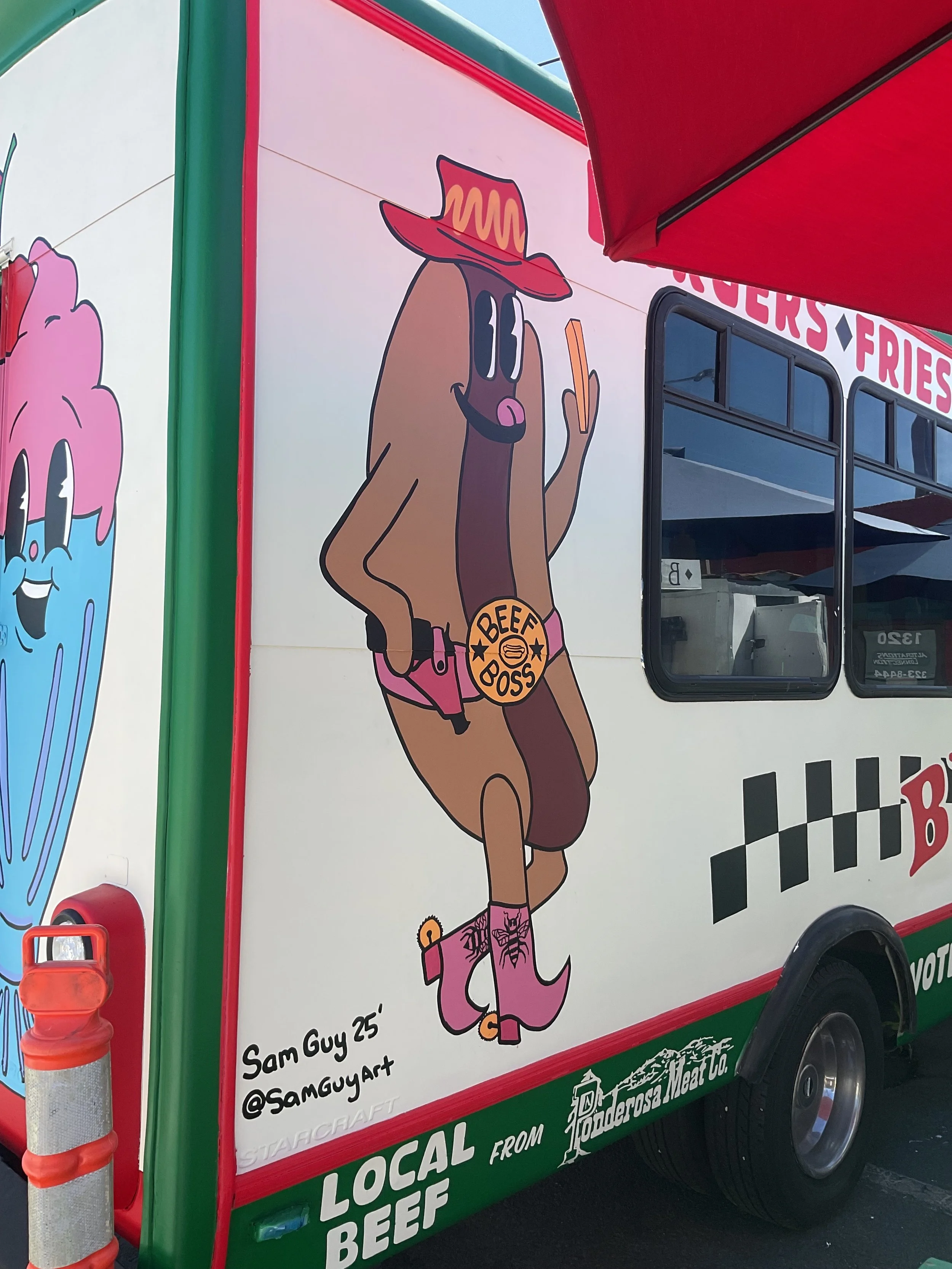


When I presented the concepts and a proposed budget to the owner, the response was overwhelmingly positive. He had only one special request: to incorporate subtle tributes to two friends he had lost. I designed these memorial elements—a bee and a bull—as hidden symbols within the mural, creating meaningful Easter eggs that added a personal and emotional layer to the piece.
For the lettering, I used vinyl stencils to ensure crisp, clean typography across the curved surface of the bus. Working at this scale posed new challenges, but my experience in Adobe Illustrator—and the ability to build artboards up to 14 feet wide—made it possible to produce highly accurate stencils.
Character Illustrations
The character illustrations were projected onto the bus at night and traced in pencil, allowing for precise placement. I masked off surrounding areas and used spray paint to bring the characters to life, finishing them with bold linework using oversized paint pens. The final details really helped the illustrations pop and gave the mural its distinctive style.

Shinyribs
Shinyribs
Merch Package
I designed the packaging for Shinyribs’ BBQ sauces and seasonings, blending Texas BBQ culture with the band’s identity. Using a palette of deep reds, burnt oranges, and earthy greens, I created simple yet bold designs that reflect the rustic vibe of both the region and the music. A quirky Western font and a sun illustration—created in collaboration with my sister—added personality to the labels.

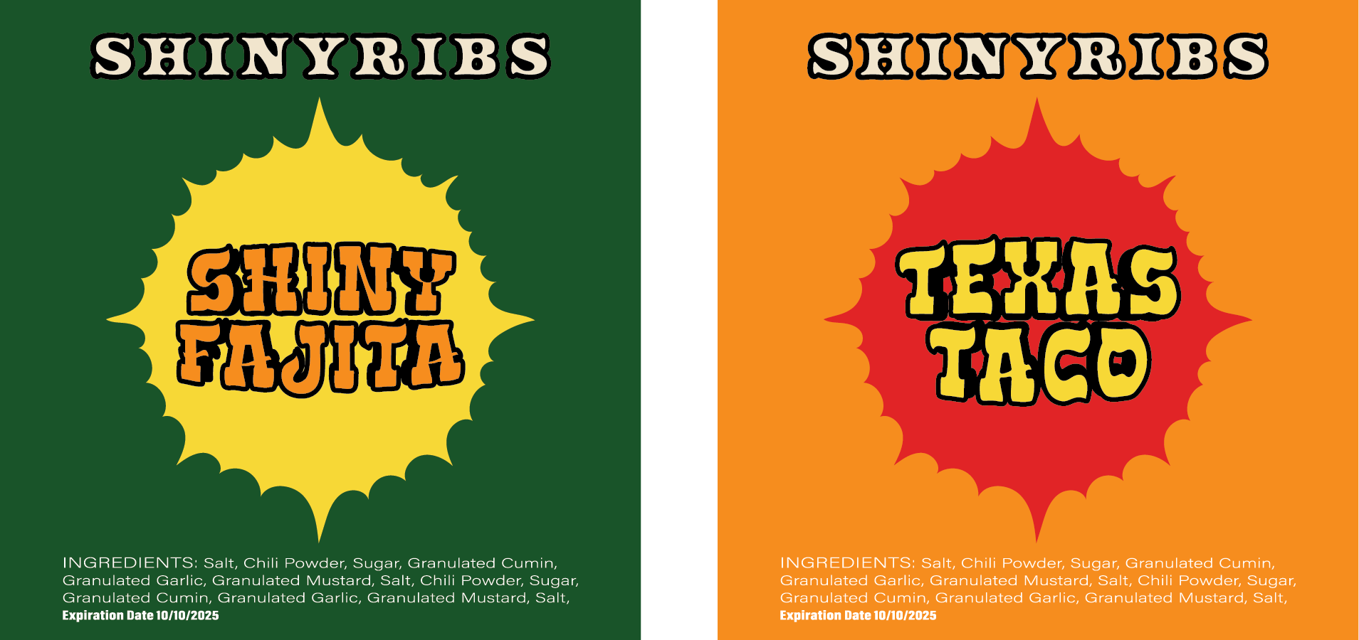


Despite constant adjustments to sizing and dimensions, the project was a success, with products quickly selling out. The client was thrilled with the final result, leading to additional designs for shirts and stickers.

Shirts and Stickers


The project was a collaborative effort, with my sister contributing character sketches and the sun illustration that became a central part of the design. To reinforce the Western theme, I used a stylized, quirky font that added a playful touch to the packaging. Throughout the process, I worked closely with the client to make constant adjustments, particularly in terms of sizing and product dimensions.

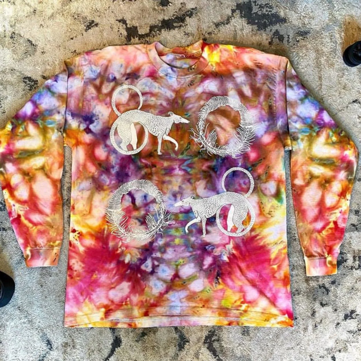
Screen Prints
Screen printing is one of my favorite methods to design for, there’s nothing quite like seeing your work transferred cleanly onto a wearable, walking piece of art. Creating for screen printing requires careful attention to sharp vector shapes and clean line work, ensuring the design translates well across fabric and other materials. Below are three different screen print projects that showcase my approach to this process.


“A Sibling Up-cycling Screen Print co”
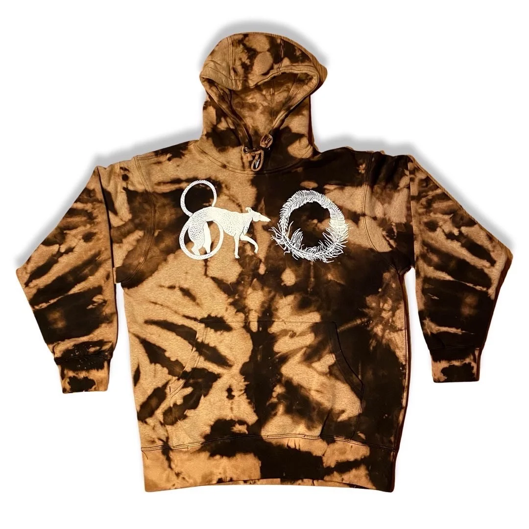
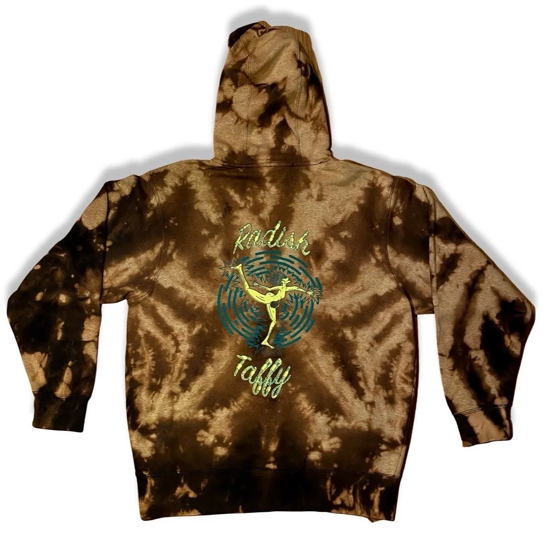
Radish Taffy is a collaborative up-cycling screen print brand I co-founded with my siblings. The designs reflect a mix of each of our creative styles and a shared love for the whimsical and weird. The custom logo—a playful tangle of illustrated worms—perfectly captures the offbeat spirit of our work. Each print is created with sustainability and self-expression in mind, making every piece unique.
Demon Dawgs


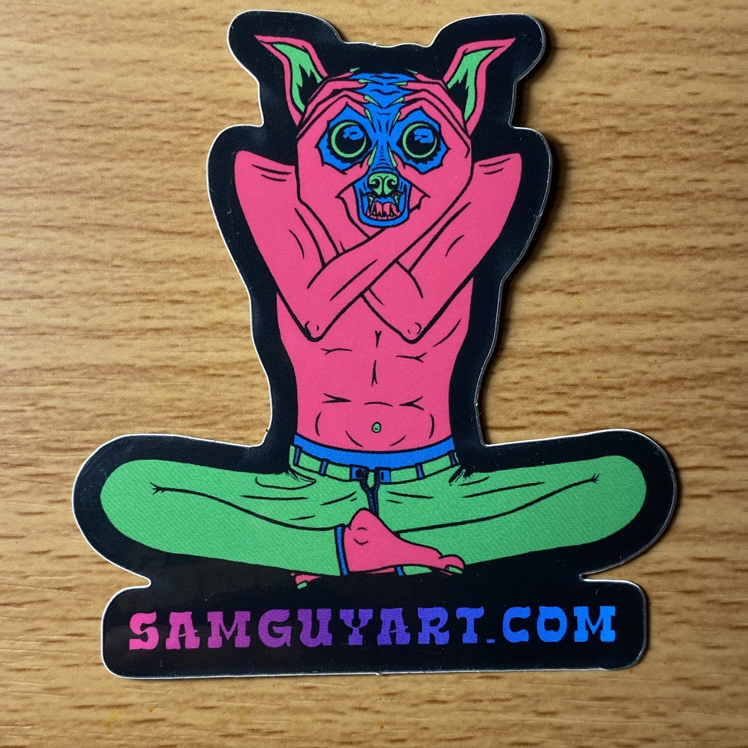
Of Course we Have Stickers!


Demon Dawgs
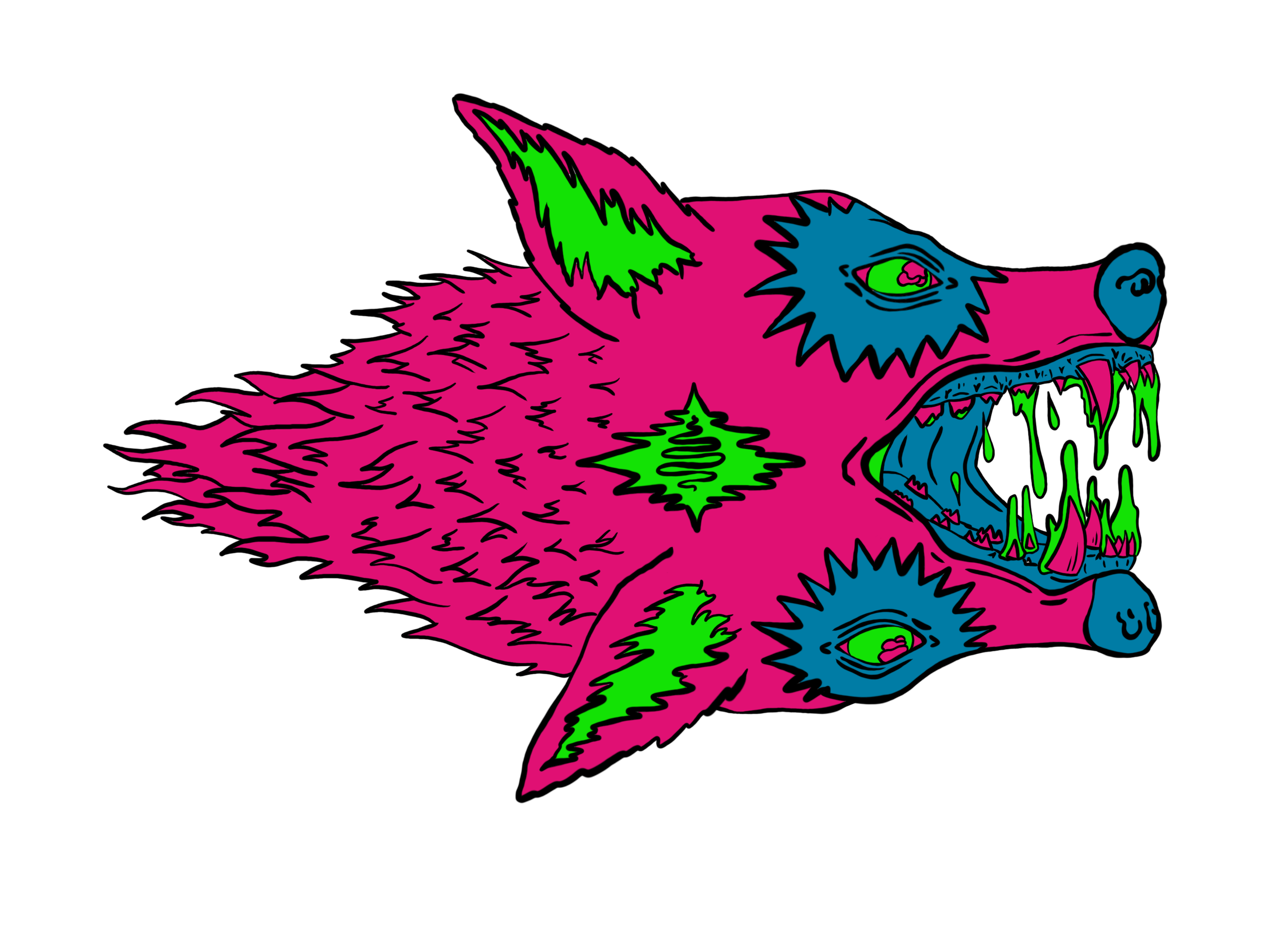
Originally created as a class assignment to develop a three-color screen print, Demon Dawgs became a bold experiment in illusion and constraint. I challenged myself to suggest black linework without using black ink at all—relying solely on negative space and printing on a black background. The result is a layered and high-contrast design that feels both graphic and gritty.
Solo Artistic Prints
My most recent screen prints are based on personal illustrations exploring themes of mischief and the supernatural. These pieces often feature subtle demonic figures—not as representations of evil, but as playful, chaotic elements that challenge expectations. This ongoing body of work reflects a deeper personal narrative, where bending the rules is part of the art.


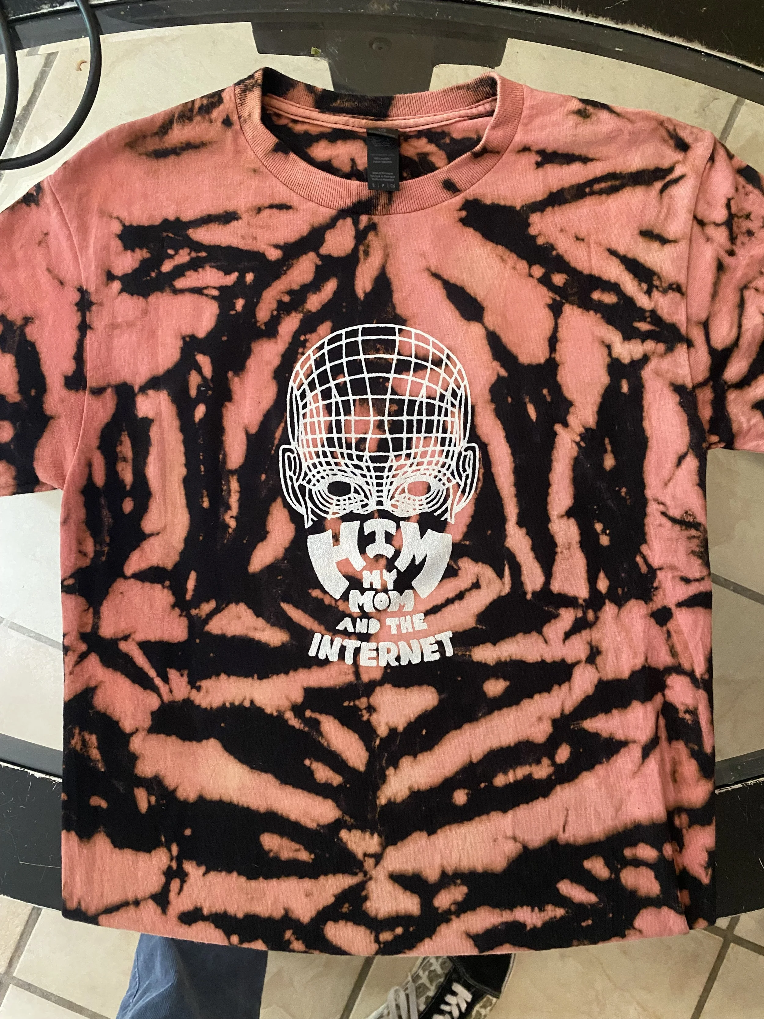
“Wrapped Up” 2025
The mascot characters— a chimp, a mom, and a minimalist line-drawn face representing "the internet"— have become central figures in our visual storytelling. These characters and themes have slowly grown to define the band's aesthetic, and I’m planning to develop a bit of lore behind them as the band’s story continues to unfold.
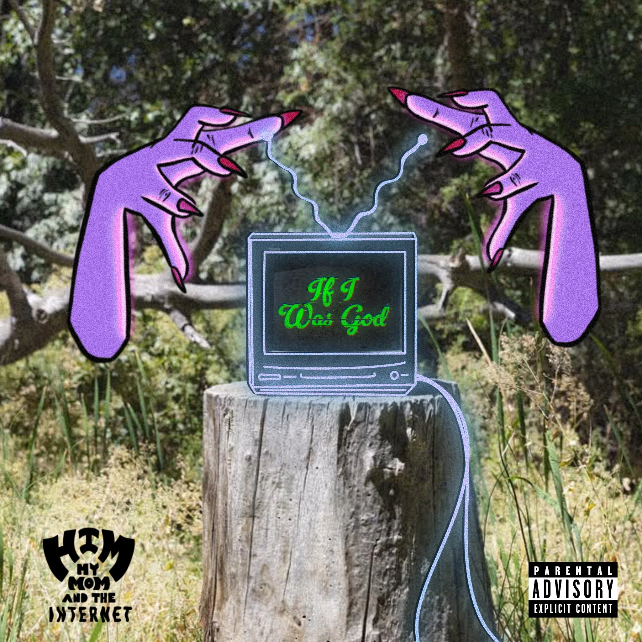
“If I Was God” 2025

“City of Rain” 2025


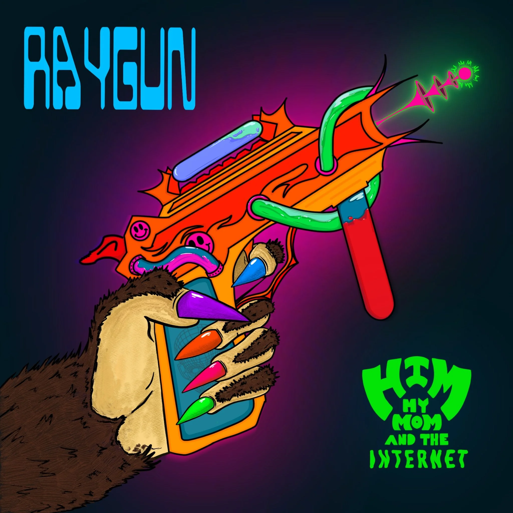
“Raygun” 2025
Animation and Video Work
Recently, I’ve expanded into animation, creating promotional videos and visual content to accompany our music. One of my favorite projects so far has been animating the Ray Gun cover. In this animation, the monkey paw aims the raygun and shoots a laser, creating a dynamic, looping visual that’s both playful and engaging. This addition to our band’s branding has helped bring the art to life in a way that enhances the overall experience of the music.
Posters and Merch

Album Art
I’ve created four distinct album covers for the singles we’ve released so far, and each one is designed to feel like it’s part of the same visual universe. My goal with these covers is consistency while allowing each piece to represent the unique mood and tone of the track. For example, the Ray Gun cover features a monkey paw gripping a raygun—blending the playful and futuristic vibe we’re going for. I used a sci-fi style font and incorporated our custom logo (which I designed) to tie everything together visually.